
Mike Childs: The Journey: Grids, Color and Curvilinear forms, 2004 to 2020
- David Eichholtz
- Jul 12, 2020
- 7 min read


Mike Childs: The Journey: Grids, Color and Curvilinear forms, 2004 to 2020
By David Rhodes
Exhibition Extended Through August 1, 2020 Link to the full article here
Toronto-born and South Bronx-based Mike Childs has been working in New York since 1995. In this exhibition, 28 paintings from the last 16 years are presented, revealing a constant and evolving exploration of how humans negotiate their surrounding modularly built, urban environment. Patterns and contiguous space interface, interlace, and proliferate like so many passing surfaces and colors, changing with the passage of time or the panorama of a gaze. Walls, graffiti, signage, and bridges of the Bronx all began to fold into the flux of Childs’s images during his time living in the neighborhood. The paintings are committedly non-objective, use geometry and color to explore compositional possibilities, but evoke Childs’s experiential surroundings, not literally, but rather through abstract, pictorial themes.

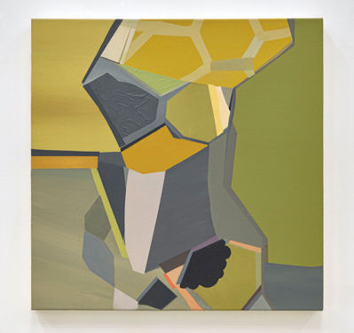
Mike Childs
My German Friend, 2012
Acrylic and spray paint on canvas
50 x 62"
My German Friend (2012), one of the larger-scale paintings here at 50 × 62 inches, comprises a shifting aggregate of colored surface and tessellated forms, grouped around a central divide of vertical grey and green that bisects two contrasting geometric zones that recall the façades of modernist or project buildings, their windows, and balconies. The composite nature of the image conflates pictorially what we do with memory or thought, moving back and forth spatially and temporally, a mnemonic montaging sometimes consciously directed, most times not—this is the true quality of our ongoing experience: fractured, fluid, split. The acrylic and spray painted yellows, greens, blues, and greys produce optically a muted yet crisp, at turns faded, illumination in the city with electric lights or overcast skies and pockets of green, an organic foil of trees to concrete and synthetic clad sides of buildings. Particularly in the ochre yellows to the left and the green and green blues to the right, a movement of rounded shapes occurs in the close tones and turning curves.

Mike Childs Animal Behavior F, 2017 Acrylic and spray paint on canvas 24 x 24" Click here to view artwork
Animal Behavior F (2017), again acrylic and spray paint, evinces a different range of color; its hexagonal patterning, like a screen or honeycomb, also appears in other paintings from this series. Dark reddish-pink panels on either side of the patterned area partially frame it to create an opening, like a window or gap between separate structures. There is the use of stenciled shapes, improvised playfully yet effective, gesture toward a tight and specific composition. There are no unconsidered areas: Transparencies, allowing a priori shape and color to remain visible after subsequent layers have been added, are striking in the left side of the dark pink. Within the hexagonal shapes other compositions can be seen: segments, independently balanced and self-sufficient, accumulating so many contiguous thoughts, one different from, though no less important than, the other. Animal Behavior G (2017) further combines the series’ vocabulary, reorienting the composition so that frontal and topographic are spliced together in a kindred conceptual strategy.
Mike Childs
Animal Behavior G, 2017
Acrylic and spray paint on canvas
24 x 24"
In Childs’s paintings, an object is not simply fractured to recombine in splintered parts. Childs implies a frontal view that has taken a walk around the object; he then puts the different views together, and this completely mobile point of view, one that includes other elements of closeness and distance, is inserted into the composition. The paintings bring to mind the work of Gary Stephan, that great progenitor of very real but impossible realities, who creates another place only possible in painting, and perfectly suited to it, one that is still unsurpassable in other media—factual, static surfaces that confound and move, conceptually and optically in all the ways we have to gauge and engage the world. Childs moves successfully along this same path, too.

Mike Childs 1000 lbs, 2018 Acrylic and spray paint on canvas 64 x 79" Click here to view artwork
MIKE CHILDS
The Journey: Grids, Color and Curvilinear forms,
2004 to 2020
Extended Through August 1, 2020
Click here to go to the exhibition
David Richard Gallery, LLC
211 East 121 ST | New York, NY 10035
P: (212) 882-1705
www.davidrichardgallery.com
David Richard Gallery is pleased to present its first solo exhibition of paintings by New York-based artist Mike Childs. The presentation includes 28 paintings that survey the subtle, but important transitions in formal concerns and compositional elements in the artist’s paintings from 2004 through 2020. This is not intended to be a comprehensive retrospective, but rather a survey of paintings that touch on several key aesthetic themes that have been prevalent in Childs’ work over a couple of decades to varying degrees of emphasis. The real focus is on his consistent and dedicated path to exploring non-objective abstraction within the parameters of color, geometry and dynamic compositions, yet always evolving and pushing the depths of his compositions and range of aesthetic elements.
The exhibition will be on view through August 1, 2020 at David Richard Gallery located at 211 East 121 Street, New York, New York 10035, P: 212-882-1705, also by appointment and online by clicking here

About the Exhibition:
The paintings in this exhibition span the past 16 years of Mike Child’s studio practice. This presentation was curated from a recent studio visit with the artist. He had to move studios in the Bronx this spring and while doing so, began to post paintings from various earlier series, many of which had not previously been presented formally in any exhibition. When I visited his new studio, he had hung many of them for me to see in person. As I viewed, I noted many common aesthetic themes that unify his work and specifically commented on some of the subtle shifts in his work over the 2 decades that enhanced the richness and depth of his compositions and the viewing experience. Hence, it was decided those selections in his studio should be his first solo exhibition in the gallery to chronicle his journey since 2004 and set the stage going forward for the next new series of paintings.

The aspects of Childs’ paintings that have remained constant throughout the past several decades include his command and control of color, always hitting the values consistently and spot-on regardless of the palette. The strong color harmonies instantly unify and pull seemingly disparate elements together. The grounds are consistent and geometric, usually some variation on a grid and more recently honeycomb shapes have replaced the four cornered structures. The geometric shapes are inspired by Childs’ long-time interest in architecture as well as the urban environment and more recently, the ever-present signage and brand marketing in contemporary culture.

His compositions fully cover the canvas surface, most running off the edges and rarely with a single centrally located focal point. This technique and slight asymmetry keeps the paintings fresh, as there is movement and activities across the canvas and beyond. The viewer is only aware of the portion of a possibly larger picture that the artist is sharing with the viewer within that single canvas and within that moment in time. Anything beyond that is subject to the viewer’s own imagination, which makes the paintings dynamic and the viewer wanting more to complete a possible narrative. Thus, there are numerous harmonies within these paintings, including the color palettes and values as well as structure of the grounds within a single painting and the canvas-filling and all over compositions that capture only a discrete moment.

Certain elements of Childs’ paintings have evolved and changed over time that include his creation of illusory space and depth within his paintings. In general, his compositions were rather flat using only planar geometry and defined shapes anchored on a highly structured grid. The illusory spaces are achieved by leveraging the structures within the grids and creating internal boxes and point-to-point lines that create the illusion of cubes, yet in a reductive and suggestive manner versus a literal depiction of a cube per se. The artist also models certain passages and discrete areas with meticulous value gradients of color. Another, more recent technique includes very subtle stacking of short geometric segments that emerge out of intersecting shapes that have different value shifts of the same color that suggest layers or steps into the picture plane or projecting out of it. It is subtle, but often situated at a few points around the painting and combined with other subtle treatments, the feeling conveyed is one of transitions in depth of the various planes and shapes of color within the composition.

Childs also began to incorporate relatively large curvilinear forms and shapes in combination with his highly geometric and gridded compositions. Often these are large passages of a single flat color or modeled in some painterly fashion. They are not necessarily biomorphic, but rather non-representational and more of a compositional break in the rigorous geometry of his early compositions. While these shapes or the titles of certain paintings reference animals and insects, the influence of nature is present, but more from an awareness of architectural structures in nature, such as the bee’s honeycomb and spider webs.

The newest and most subtle effect is his use of texture to create subtle geometric shapes and forms within large passages of a single hue. Again, it is subtle and most noticeable in close proximity to the paintings or depending upon the angle of incident light and the cast shadows. The effect makes the surface active and the painting dynamic, while very reductive and understated in its execution. The theme of geometry, gridded grounds and harmonious color palettes remain a constant with the new curvilinear shapes and textured surfaces.

About Mike Childs:
Born in Toronto Mike Childs received his BFA from the University of Guelph, Canada, and an MFA from Florida State University. He is the recipient of several awards including a 2006 Pollock-Krasner Grant and a Lower Manhattan Cultural Council Project Award. At 26 he received an award to live, paint and teach in Florence from Florida State that cemented his desire to work in the urban environment. His work has been exhibited nationally and internationally and has had numerous solo and two person shows. He maintains a studio in the south Bronx.
After a childhood in Toronto, Childs moved to New York in 1995 and has been working on his patterned architecturally based abstractions ever since. The constantly changing urban environment and how humans negotiate this space is of main concern to Childs and continually informs his work. Influences of urban icons such as old bridges, crumbling walls, graffiti art and the signage of the south Bronx have begun to seep into his work.

All Artworks Copyright © Mike Childs All Images Copyright © Yao Zu Lu


Comments